Final Reflections — Final Week
I approached the specter of a history class with dark reservations. I had visions of armies of boring, unrelated facts invading my brain, demanding that I remember their dates and names. The book is huge: more than 573 oversized pages with smallish typeface and, thank goodness, ample illustrations. It covers things graphic-art-ish beginning with cave paintings and ending with computers. Yes, I did occasionally get bogged down in many names and seemingly unrelated movements. Yet, as the semester progressed, the armies began to prevail, and unexpected transformations in my interests began.
The first new learning that tickled my awareness was that our book itself is, in a way, a work of graphic art. It is not of the high quality (and uniqueness) of the illuminated manuscripts we saw, nor could it compete with William Morris’ Kelmscott Press publications, but its layout is varied and pleasing and has a certain unity, and the illustrations are marvelous. (This revelation makes me a little upset that I used a highlighter when I was still uncertain of the value of the book and course. Margin notes can make re-reading a book more interesting, but a highlighter … not so much … ) As the semester progressed, I began to be more aware of design everywhere, and to be able to relate some of the graphics around me to history we had studied. Helvetica is everywhere. I suddenly became excited to gather a new tidbit about a well-known designer or foundry or new typeface. History began to be part of the present as a result of this class.
The class would have been more valuable if I had discovered at the very beginning that reading the modules first is quite useful. The modules provide a scaffolding for the many details in the book. Even with the clear modules, I’m still unsure of some major movements, such as Plakatstil, and I still need to read and study more. Amazingly, I actually want to read more. History has prevailed and enticed me to the Dark Side.
Of course, this graphic arts history was not presented in a void. We touched on the history of the times in which these graphics were created, learning how politics, culture and technology affected their creation. I would be interested in learning more about the anthropological implications of the history of graphic arts. One interesting theme became apparent: although graphics reflected changes in human culture, they also reflected constants in human nature. Change was inevitably greeted with mistrust and resistance, and the workers at the bottom rung of the publications ladder usually had many complaints. Lessons for us in the present, no doubt: try not to work on the bottom rung any longer than necessary; diversify; and remember to evaluate change with an open mind.
After reading this book and considering this course, I predict that graphic arts will continue in a similar pattern of changing along with evolving technologies and, I hope, continuing to borrow from the ideas of the past. Perhaps a better description for this field than “graphic arts” will be found, a description that combines the fine arts aspects of the field with its powerful and somewhat dangerous persuasive and communicative aspects.
I’m truly glad to have taken this course online. Having a teacher and fellow students who are actually engaged makes all of the difference. The professor’s diligence and generosity with his time helped me learn .. even forced me to learn at times, and to enjoy learning despite myself. By taking it online, I could see thoughts from all of the students, even the ones who might be a bit shy in person, and there was the opportunity to mull over their words. It was humbling, too, to see so many people smarter and more expressive than I am, in one place. I really enjoyed it.
Alas, I still don’t have a definitive definition for “graphic arts.” Is there one?
The End
There are three responses to a piece of design – yes, no, and WOW! Wow is the one to aim for. — Milton Glaser (http://psd.tutsplus.com/articles/inspiration/50-inspirational-quotes-on-the-art-science-of-design/)
We come to the end of our perusal of graphic design history. Of course, history never ends, since it is always in the making. Having looked at the past, we can look at the present to divine the future. Our text mentioned the upcropping of ‘zines, made possible by the advent of desktop publishing. One way we could keep up with current developments is through current design publications, many of which are still available in print, some of which are in print and online, and some of which have morphed into solely online publications. (This might give us pause to wonder about the future of printed material, and decide how this will affect our own designs. Will be champions of print, or bow to the times, or find a middle road?)
Britain has a particularly vigorous design publications industry. Back in the days of Borders, I loved to sit in their café and browse the many design magazines from the UK and America before deciding which was dollar-worthy – actually, many-dollar-worthy. (This brings into question once again the future of printed materials as we take a moment to remember Borders.) Communication Arts Magazine was one of my favorites. It is mostly viewable online, with articles such as “Add Some Zing to Your Typography in Photoshop” (http://www.computerarts.co.uk/tutorials/add-some-zing-your-typography-photoshop). Our newly acquired knowledge of the  history of graphic design might give us a new perspective on such articles. Considering the exacting care typeface designers accord typefaces, would we really want to make our letters so extremely ornate as this article advocates? Is this sort of wildly modified typeface a passing fad or a possible new trend? Almost every new method of design we
studied was at first met with scorn by entrenched Olde Guarde, so we would have to consider our answer carefully.
Our evaluation of the Wild A might be influenced not only by our readings in Meggs, but by perusing the web and another favorite design magazine of mine, “Print.” In an article titled “The Good, the Bad and the Ugly” (available online at http://www.printmag.com/Article/The-Good-the-Bad-and-the-Ugly),
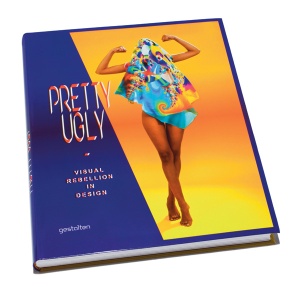
Rick Poynor reviews a book titled Pretty Ugly: Visual Rebellion in Design. He points out that the controversy over “ugly” in graphic design was engaged in the 1980s and early 1990s, and finds justification for designs that traditional values would label “ugly.” This is a continuation of the question “What is good design, after all?” that was historically addressed in our book. (Another innovation of the computer age is enhanced interactivity; readers can comment on the article online. I still hold that this isn’t nearly as satisfying as holding a slick copy of Print in my hands. Book sniffers – and, yes, I do smell books – would be heartbroken if printed materials disappeared.)
Another design magazine that has made a presence for itself online is How magazine, albeit a bit more tentatively than Computer Arts and Print. It offers subscriptions in print, digital and on the Ipad. (Can a magazine survive economically by selling itself the same way an eBook is sold?) It doesn’t present as much of its material online as the other two magazines, but it does offer some articles, information about events and competitions, and a free design newsletter. Its available articles do offer a great deal of information, but few images. For instance, the article “42 Typographic Resources for Designers” offers numerous sites and resources, but graphics consist mostly of headings:
(http://www.howdesign.com/how-magazine/how-july-2011/type-resources/4/)
Perhaps How considers images one bit of important graphic they feel they must sell rather than distribute freely. There is an image on their home page of a How magazine on an IPad, which brings me back to the question of trends and aesthetics in graphic arts: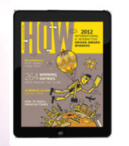
(http://www.howdesign.com/magazine/)
There are large numbers of lists of design magazines online. One at http://www.webdesignerdepot.com/2009/01/14-essential-magazines-for-graphic-designers/
lists Layers, Photoshop Creative, .Net, Print, I.D., How, Communication Arts, Digital Arts, Before & After, CMYK, Computer Arts, Computer Arts Projects, and Advanced Photoshop (and gives viewers the opportunity to subscribe. Ah, Borders.). Whatever views about graphic design and graphic design history we’ll take away from this class, we have plenty of opportunity to review and revise them as history continues to be made. Our studies this semester will help us to do this in a more informed and open-minded manner.
Chapters 21 and 22
As the term ‘graphic arts’ is currently used,it can be applied equally to printed objects that are works of art (etching, engravings, woodcuts, etc.) and to those that convey only specific information (menus, announcements, books, etc.). Thus, both Picasso and the man who prints your laundry tickets can legitimately call themselves graphic artists.” –Milton Glaser (http://aceandson.com/blog/?p=920)
This week we look at design in the second half of the 20th Century, especially at poster design. As we move into contemporary designers, information becomes strangely difficult to acquire in some cases. For instance, when I decided that because it is refreshing to see a famous designer who is a woman, I would look more closely at Marian Nowinski, famous Polish poster designer, I discovered three things. One, Marian Nowinski is a man. Two, even Wikipedia doesn’t have an article about Nowinski. Three, it’s easy to find products (posters) related to Nowinski to spend money on, but information is a more elusive commodity.

This photo shows two of Push Pin Studio’s founders, Seymour Chwast and Milton Glaser, with Glaser’s famous Bob Dylan poster in the background. It is taken from the book The Push Pin Graphic: A Quarter Century of Innovative Design and Illustration by Seymour Chwast, Steven Heller, M. J. Venezky Seymour Chwast, Steven Heller, and M.J. Venezky (viewable through Amazon’s “Look Inside” feature at http://www.amazon.com/The-Push-Pin-Graphic-Illustration/dp/B00120VJ0M). Somewhat ironically, the book can be purchased “cheaply” at Amazon for only $150 for a slightly damaged copy, or can be bought new for $962.57. The work of Push Pin Studio must be seen by the public to be successful, but the book about Push Pin Studio is not meant for the average Joe on the road. Does the book use really, really good ink? Or is information in danger of becoming an expensive merchandise? It’s a mystery.

(image from
http://www.poster-books.com/music/push-pin-graphic-design-and-illustration.shtml )
Week 8: Chapters 18, 19 and 20
There are no formulas in creative work. I do many variations, which is a question of curiosity. I arrive at many different configurations-some just slight variations, others more radical-of an original idea. It is a game of evolution.
 (image from http://meansheets.com/2010/04/27/rand-om-thoughts/)
Paul Rand, designer extraordinaire, was born Peretz Rosenbaum August 15, 1914, in New York. (1) A Jewish surname in the early decades of 20th Century America made it more difficult to find work in advertising, which could account for the change of his name to Paul Rand, which with “four letters here, four letters there, would create a nice symbol.” (2) Peter Behrens noted that “Rand’s new persona, which served as the brand name for his many accomplishments, was the first corporate identity he created, and it may also eventually prove to be the most enduring.” (3) Whatever the name, the talent and drive were there, and Rand persevered in his design aspirations, despite the fact that his father was convinced that a man couldn’t make a living in art and tried throughout his childhood to dissuade him. (4)
 (a sample of logos by Paul Rand. Image from http://www.iconofgraphics.com/Paul-Rand/ )
Rand’s stubbornness did persuade his father to allow him to take night classes at the Pratt Institute with the provision that he attend public high school at the same time. (5) Interestingly, professional sources such as the Art Directors Club emphasize that Rand was a “former student at the Pratt Institute” (6), but he is popularly known as a self-educated designer. Rand himself contended that he “had literally learned nothing at Pratt; or whatever little I learned, I learned by doing myself”. (7) Rand drew inspiration from Laszlo Moholy-Nagy, A.M. Cassandre, and E. McKnight Kauffer, and “a magazine–a single copy of Gebraushgrafik, from a tiny bookstore next door to the Brooklyn Paramount theater” (8). This is not to say that Rand was against formal education. He attended Parsons School of Design and the Art Students League at various times, and taught at Yale from 1956 until his retirement in 1985. (9) Based on his writings in “The Politics of Design,” we could even assume that Rand would approve of our study of graphic history in this course. He wrote: “… trying to produce good work is very often an exercise in futility. Ignorance of the history and methodology of design — how work is conceived, produced, and reproduced — adds to the difficulties and misunderstandings.” (10)
Paul Rand is probably best remembered for his corporate branding. He designed many ad campaigns, and proved to be a talented typographer and book designer. He also authored many books, including three children’s books co-authored with his wife Anne. titled Sparkle and Spin, Little 1, and Listen! Listen!. (11) He took joy in creating trademarks; as a matter of fact, he was designing trademarks on November 26, 1996, the day he died at the age of 82. (12)
 (image from http://www.brainpickings.org/index.php/2012/03/27/little-1-paul-rand/ , where entire book can be viewed)
Imaginary forces created a short entertaining movie with clips from Paul Rand speaking about design and its meaning. http://www.imaginaryforces.com/featured-work/experience-design/paul-rand-film/ for Rand’s posthumous induction into the One Club Hall of Fame.
Even though Paul Rand was seminal in introducing modernism to America, his aversion to most graphics that espoused post-modernism. In “Confusion and Chaos: The Seduction of Contemporary Graphic Design,” Rand wrote “These inspirational decorations are, apparently, convenient stand-ins for real ideas and genuine skills.” and “Today’s Dada, if it can be called that, is a revolt against anything that is deemed old hat. Faddish and frivolous, it harbors its own built-in boredom.” (13) This in turn led to some criticism of Rand. For instance, someone named Mark Favermann considered Rand’s attitude one of “a reactionary, angry old man.” (14) Look at Rand’s logos, still famous today. Look at Mark Favermann, hardly known today. I’m voting for “designer of impeccable taste” rather than “angry old man.” Rand evolved in his life and his design, and maintained his standards throughout.
Rand appeared on an Apple “Think Different” poster:
 (image from http://www.paul-rand.com/assets/bio/bio_pic3.gif )
The full version of the text which accompanied Apples “Think Different” ads rather sums up a perspective on Paul Rand:
“Here’s to the crazy ones. The misfits. The rebels. The troublemakers. The round pegs in the square holes. The ones who see things differently. They’re not fond of rules. And they have no respect for the status quo. You can quote them, disagree with them, glorify or vilify them. About the only thing you can’t do is ignore them. Because they change things. They push the human race forward. While some may see them as the crazy ones, we see genius. Because the people who are crazy enough to think they can change the world, are the ones who do. – Apple Inc.” (14)
———————
- http://en.wikipedia.org/wiki/Paul_Rand
- http://www.iconofgraphics.com/Paul-Rand/
- http://www.paul-rand.com/foundation/biography/
- http://www.paul-rand.com/foundation/biography/
- http://en.wikipedia.org/wiki/Paul_Rand
- http://www.adcglobal.org/archive/hof/1972/?id=300
- http://www.iconofgraphics.com/Paul-Rand/ (quote from an interview with Paul Rand by Steven Heller in 1988)
- http://www.logomojo.com/logo-design/paul-rand
- http://www.yale.edu/opa/arc-ybc/ybc/v25.n16.obit.03.html
- http://www.paul-rand.com/foundation/thoughts_politics/
- http://www.brainpickings.org/index.php/2012/03/27/little-1-paul-rand/
- http://www.iconofgraphics.com/Paul-Rand/
- http://www.paul-rand.com/foundation/thoughts_confusionChaos/
- http://www.paul-rand.com/foundation/biography/
- http://en.wikipedia.org/wiki/Think_Different
Week 7: Chapters 16 and 17
“That’s not art!” — Theodore Roosevelt about The Armory Show. (http://en.wikipedia.org/wiki/Armory_Show)
http://en.wikipedia.org/wiki/Armory_show

This week we read Chapter 16 “The Bauhaus and the New Typography” and Chapter 17 “The Modern Movement in America.” Chapter 17 begins with a brief reference to “the fabled 1913 Armory Show.” Fabled? Why fabled? What influences did this show have on modernism in America, and particularly on graphic arts?
Meggs mentions that in the 1920s and 1930s American graphic design was primarily traditional, sentimental, and realistic, while in Europe various branches of modernism were growing and flourishing. However, Meggs doesn’t mention that even in the early 1900s, some American artists were breaking free from academic art and experimenting beyond realism. Among those were four young artists (Jerome Myers, Elmer Macrae, Walt Kuhn and Henry Fitch Taylor) who founded the Association of American Painters and Sculptors in 1911 in order to “lead the public taste in art rather than follow it.” (1) Their first order of business was to begin to organize the Armory Show, which would display modern European artists side by side with modern American artists. So, despite the very traditional slant advertisements and graphics followed in early 20th Century America, a hint of modernism was slowly seeping into the American art scene.
 Entrance of the Exhibition, 1913, New York City —http://en.wikipedia.org/wiki/Armory_show
The Armory Show was to open in 1913 in New York’s 16th Regiment Armory, and would display 1250 paintings, sculptures and decorative works by 300 European and American artists (2). Some names that are still familiar today: Thomas Eakins, Victor Salvatore, Marcel Duchamp, Edward Hopper, Henri Rousseau, Henri Matisse, Paul Cezanne … the list goes on and on. Although some journalists enthusiastically anticipated the show, many others were disparaging the very idea of a modern art show even before it opened. While the New York Times ran headlines such as “It Will Throw a Bomb Into Our Art World and a Good Many Leaders Will be Hit” (3), other newspapers such as The New York Sun declared “Notable International Art Show Now Ready.” (4) Was America ready for modern art, or would traditional realism prevail?
The answer was, “Yes.” Many regard the Armory Show as “a moment of cultural crisis and a radical break with tradition” (5), a moment that polarized American public opinion about art – but all the same, a moment that made art a hot topic. Many were outraged. The most infamous “star” of the show was Marcel Duchamp’s “Nude Descending a Staircase” (called by the New York Times “an explosion in a shingle mill” (6)) in Gallery I. People flocked to Gallery I like seagulls to tossed bread. News reports accused the Armory Show of “quackery, insanity, immorality, and anarchy” (7), but it was a great financial success. Over 87,000 people attended the 1913 Armory Show, and most of the art sold to American galleries and institutions. (8) (To take a virtual “tour” of the 1913 Armory Show, visit “As Avant-Garde as the Rest of Them: An Introduction to the 1913 Armory Show.” at http://xroads.virginia.edu/~museum/armory/intro.html)

http://xroads.virginia.edu/~museum/armory/galleryI/duchamp.nude.html
The Armory Show had lasting effects on American art and graphic arts, and even European graphics. When the Show went to Chicago, outraged students from the Chicago Art Institute burned three Matisse paintings in effigy. (9) On the other hand, a visiting student, Ted Kauffer, saw avant-garde work for the first time at the Show, which years later inspired him to design the first Cubist advertising poster printed in England, “Flight.” (10)

http://www.designhistory.org/Poster_pages/AmericaPosters.html
New York eventually became a Mecca of avant-garde art. As Meggs pointed out, government-sponsored and corporate-sponsored fine art and graphic art in America transitioned public taste from the previous traditional output to the more modern designs we’re accustomed to seeing today. Or did it? The Gerber baby has changed very little since 1928; Norman Rockwell is still famous; Thomas Kinkade sold very well.
All of the history we’ve read so far indicates a human tendency to resist change. When harbingers of change rear their ugly heads, we fuss and fight and fume … then discover that while humanity as a whole might not have completely transformed, most of us have at least stretched a bit. After awhile, change isn’t new any more, so we wait for the next new change to threaten our security and stop fussing about the old one. The fabled 1913 Armory Show stretched American taste, but we haven’t completely abandoned previous ideas.
Footnotes:
(1) http://www.askart.com/askart/interest/new_york_armory_show_of_1913s_1.aspx?id=15
(2) http://xroads.virginia.edu/~museum/armory/entrance.html
(3) http://xroads.virginia.edu/~museum/armory/intro.html
(4) http://www.artandeducation.net/paper/the-1913-armory-show-much-ado-about-everything/
(5) http://www.askart.com/askart/interest/new_york_armory_show_of_1913s_1.aspx?id=15
(6) http://www.artandeducation.net/paper/the-1913-armory-show-much-ado-about-everything/
(7) http://en.wikipedia.org/wiki/Armory_show
(8) http://www.artandeducation.net/paper/the-1913-armory-show-much-ado-about-everything/
(9) http://www.askart.com/askart/interest/new_york_armory_show_of_1913s_1.aspx?id=15
(10) http://www.designhistory.org/Poster_pages/AmericaPosters.html
Week 6: Chapters 13 through 15
“Colour is the key. The eye is the hammer. The soul is the piano with its many chords.” — Kandinsky (http://www.wassily-kandinsky.org/wassily-kandinsky-quotes.jsp)
Wassily Kandinsky (1866 – 1944) is often dubbed father of abstract art. Over time his art evolved from representation of recognizable forms to work that communicated entirely through line and especially color. Kandinsky’s expressionism sought spirituality in art, in contrast to the emerging German glorification of military and government in the years leading up to World War I. Most interestingly, Kandinsky associated art and color with music and sound. In “The Man Who Heard His Paint Box Hiss” (http://www.telegraph.co.uk/culture/art/3653012/The-man-who-heard-his-paintbox-hiss.html) Ossian Ward explained Kandinsky’s aspirations very well: [Kandinsky] “wanted to evoke sound through sight and create the painterly equivalent of a symphony that would stimulate not just the eyes but the ears as well.”
Today some believe that Kandinsky had a form of neurological synesthesia, which is defined in The World English dictionary as a physical condition that causes “a sensation experienced in a part of the body other than the part stimulated.” (http://dictionary.reference.com/browse/synesthesia?s=t) In other words, the senses get crossed, and a person experiences unexpected physical sensations. For instance, hearing a particular note or tone could cause a synesthete to see a particular color or experience a particular taste; seeing a particular color could cause a synesthete to hear certain sounds. Today, scientists can ascertain whether a person is experiencing this confusion of senses neurologically, or whether the experience is psychological (“the subjective sensation of a sense other than the one being stimulated”). Wikipedia lists Kandinsky as a person “under review” for neurological synesthesia (http://en.wikipedia.org/wiki/List_of_people_with_synesthesia ). It is possible that he might be one of the many artists of the past and present who follow an intellectual desire to combine the senses and express music through art, rather than someone who is attempting to share his actual physical sensations.
Whether or not Kandinsky experienced neurological synesthesia, he did aspire to evoking music with art. He called his quicker works “improvisations” and the works that took more thought and time “compositions.” Indeed, his work is alive with rhythm and color. See, for instance, Composition VIII, 1923. (http://www.glyphs.com/art/kandinsky/)

This is one of his later compositions, which adopts a geometrical rhythm with less emphasis on color than previous compositions. All the same, the movement, the mood of music is there, causing the eye to dance back and forth from element to element just as tempo in music can cause the feet to move back and forth in a repeated rhythm.
Kandinsky was not left unpunished for his originality and loyalty to his internal vision. In 1921, he left Russia for Germany because his ideas were considered too “individualistic and bourgeois” for the radical members of the Institute of Artistic Culture in Moscow where he taught (and which he had helped organize). In 1937, the Nazi government organized an exhibition called “Degenerate Art,” which among many, many other works included Kandinsky’s Compositions I through III. That music will never be heard again; after the exhibition, his compositions were among the works fed to a bonfire.
Kandinsky is one of those historical figures I wish I could resurrect to introduce him to modern developments. A neurologist would have a field day testing him for neurological synesthesia; perhaps that would give us better insight into his work. Kandinsky himself would no doubt be intrigued by modern physic’s discoveries concerning color and sound (both made by waves; color depends on wavelength, sound on frequency). Imagine him exploring electronic music through a program such as Medisynth, where composers can use virtual paintbrushes to “paint” musical compositions. I would be most interested to hear his views on spirituality (or possibly lack thereof) in contemporary graphic arts. I’m not sure he would want to stay in our times, but I think this original abstract expressionist could teach us a great deal while he was here.
Week 5: Chapters 11 and 12
“All art is erotic.” – Gustav Klimt (http://www.arthistoryarchive.com/arthistory/symbolism/Gustav-Klimt.html)
This week in Chapter 11 we studied the bridge, Art Nouveau (1890-1910), which crossed from the Victorian era to Chapter 12, “The Genesis of Twentieth Century Design.” A “human bridge” of the era was German designer Peter Behrens (1868-1940), whose six-color woodcut “Untitled/The Kiss” was “largely responsible for popularizing the Jugendstil (or German Art Nouveau) movement” [Ola Robbins, http://www.quailhollow365.com/blog/2011/02/artwork-of-the-day-peter-behrens-the-kiss/) when it was published in in Pan, volume 4, n. 2 (1898) (http://www.spaightwoodgalleries.com/Pages/Behrens.html).
 “The Kiss” embodies many Art Nouveau characteristics:
–Flowing lines which according to Robbins “refer to the ever-present and sometimes irrational movement within nature”
–Abstraction
–Reduction
–Attention to craftsmanship (six colors aren’t simple to do in a wood block print)
–Sensuousness
The androgyny of the figures was somewhat controversial, which garnered even more attention for the movement. Reprints of this work are widely available today as posters and postcards. The original artist’s prints can be found in many museums; a print which is implied to be an artist’s print is available for “only” $3500 at http://www.spaightwoodgalleries.com/Pages/Behrens.html
(image from http://www.moma.org/collection/browse_results.php?criteria=O%3AAD%3AE%3A438&page_number=2&template_id=1&sort_order=1)
 Around ten years later (1908), Austrian Gustav Klimt (1862-1918) produced his famous painting also entitled “The Kiss.” According to Wikipedia, this painting is “a masterpiece of Vienna Jugendstil—Viennese Art Nouveau,“ a movement which followed the Berlin Secession of which Behrens was a part. Klimt’s work mirrors the simplified, idealized female facial features of Behren’s woodcut, and retains some of the curvilinear flow, but is moving toward later linear geometric designs.
(image from http://en.wikipedia.org/wiki/The_Kiss_%28Klimt_painting%29)
I find it slightly ironic that while Behren’s “The Kiss” was designed for reproduction and printing, and of course Klimt’s painting “The Kiss” was not, it is much easier to find a reproduction Klimt’s work today. Of the two, however, I think Behren’s work would be more likely to be mistaken for a more contemporary piece, if only because it has a more “graphic design” quality and foreshadows some of the flowing-haired album covers and posters that were produced in the 1960’s. Still, I suspect that if you asked any random person sitting in Starbucks today, that person would be more likely to recognize Klimt’s piece. This, too, is somewhat ironic, since graphic design is by nature aimed at the large public. Through modern reproduction techniques, a unique piece of art can enter the realm of popular reproduced graphic design.
Week 4: Chapters 9 and 10
‘Classic.” A book which people praise and don’t read.” — Mark Twain (http://www.brainyquote.com/quotes/authors/m/mark_twain_5.html) (“But if it’s a Kelmscott edition, they can enjoy looking at it.” –OG)
This week we read about “Graphic Design and the Industrial Revolution” in Chapter 9, including a visit to the Victorian era and considerable details about the vagaries of typographic design. We also studied “The Arts and Crafts Movement and Its Heritage” in Chapter 10, a chapter which emphasized book design. For the first time, I appreciated the artistic design of our textbook. In this class, we first concentrated on the many images presented in our text, then began trying to unravel the huge ball of detailed written information. Studying our book’s illustrations and the histories of modern book design this week, I finally realized that our text is more than just a text. It is a gestalt of illustration, information, typography, layout and printing. Looking at a modern book as a piece of art/craft is an interesting but disturbing experience. I would love to see a Morris edition of Chaucer, but would the beauty of the object detract from my concentration on the work itself?
One continuing theme in all of our readings is the necessity to swim with the current or drown. Job security as a trained scribe was doomed by the proliferation of the printing press (although calligraphy is practiced to this day). Scribes tried to hold back the tide with legal action that cried “unfair competition” to no avail. Each successive improvement in printing techniques resulted in the uprooting of workers who had mastered a skill that was rendered obsolete. Workers would protest or sabotage or even riot, but progress continued. Some clever designers, such as Howard Pyle, changed with the changing times. Pyle began illustrating with pen and ink and moved on to half-tone illustrations, then two-color and full-color illustrations. (See Meggs, page 172.) Those craftsmen who couldn’t or wouldn’t learn new skills faded from the graphic scene.
Skills never seem to completely vanish, however. The Arts and Crafts Movement deplored the poor quality that printed materials eventually fell into. For instance, Kelmscott Press brought master craftsman Hooper out of retirement to contribute to the production of exquisite hand-pressed books. (Meggs, page 183.) Progress in modern printing technology continued to accelerate, but even the professions of lithographers or wood block cutters or inkers could no longer employ thousands of people, appreciation for the products of methods that were no longer economically viable did not totally disappear.
Design and technology are now entering a new era with the proliferation of virtual communication. Publishing houses are tightening their belts or closing, just as lithography houses once did. Printed newspapers are slowly becoming obsolete, just as tablets, scrolls, and broadsides once did. This week, a 7-inch iPad was introduced; Kindle continues to gain popularity; Google Books offers many publications online. Our book has amply illustrated so far that people employed in traditional publications need to look ahead and develop new skills to suit the new technologies. But just as books as works of art were still appreciated after modern printing methods were established, I believe that published materials as a tactile experience will always still be appreciated and never disappear entirely. There is hope still for bibliophiles. To quote a recent NPR program: “One reader in particular told us that when he has a book that he loves, he wants to be able to access it in any format. So with the Harry Potter series and the [Song of Ice and Fire] series, he’s actually bought all of those books as print books and as e-books, just because they matter that much to him …” (http://www.npr.org/2012/10/23/163414069/americas-facebook-generation-is-reading-strong)
This week, it seems that studying history is a bit like gazing into a hazy crystal ball to determine the future.
Week 3: Chapters 5 – 8
God help us — for art is long, and life so short.” –Johann Wolfgang Goethe von Goethe, Faust http://www.goodreads.com/work/quotes/16721-faust-eine-trag-die
We continue the march through graphic design history, a tale sometimes surprisingly dramatic and bloodthirsty. Who knew that the DaVinci of typography, Gutenberg, was cheated of his own print shop? Or that in France in the 1700s unauthorized use of the state typeface was punishable by death?
Chapter 5: Printing Comes to Europe
Last week, we learned that movable type was not useful to the Chinese because of the great number of Chinese letterforms. This week, we discover that in Europe, movable type changed the European world.
Before movable type, as early as the 1300s, block printing was mass producing playing cards, devotional prints of saints, and eventually wooden picture books with religious function.
Some of the first propaganda was fed to the public in the guise of books on “the art of dying,” designed to convince parishioners to leave their worldly goods to the Church.
The first unions, in the form of trade guilds, kept progress at a slow pace by insisting on divisions between wood block designers and wood block cutters.
In the early 1400s, Gutenberg assembled the first movable type printing machines and shop, took on the arduous task of printing the forty-two line Bible, partnered with the devil in the person of Fust (proto-Faustus) who repossessed Gutenberg’s shop on the eve of the Bible’s publication. (Fust established the first powerful movable-type publishing family dynasty, but he did almost get burned at the stake for witchcraft when trying to sell printed Bibles as manuscripts. Even then, bible salesmen were suspect.)
Chapter 6: The German Illustrated Book
Human nature never changes. Scribes began to see the writing on the vellum as printing streamlined the work of publishing.In Genoa, scribes attempted to have printing banned, and in Paris scribes sued on the basis of “unfair competition.” Nonetheless, progress in printing continued.
More and more books became available to the public, and illiteracy slowly ceased to be the norm.
Printer Albrecht Pfister planted the beginnings of the illustrated typographic book when he added wood block illustrations to his books.
Travel books were created with lush illustrations.
Broadsides, the precursors to posters, became common. The everyday man was inundated with political and religious broadsides; Fox News’ ancestor, the broadside, spread such important information as deformed births.
The art of printing slowly spread from its birthplace in Mainz to Italy, to England and France. The first typographic book in English was printed by William Caxton in 1475. It seems that all of the advances in printing had not erased the heavy burden of those involved in bookmaking since the scribe Florentius complained (see blog, week 2); William Caxton wrote:
“”my pen is owrn, my hand is weary and shaky, my are are dimmed from too much looking at white paper” (Meggs, page 91.
